Last edited: July 10, 2023
Published: July 28, 2022

Mateus Mendes
Forest & GIS Engineer
BLOG POST
Last edited: July 10, 2023
Published: July 28, 2022
Mateus Mendes
Forest & GIS Engineer
Satellite imagery is an essential component of precision agriculture these days. For example, consider the capabilities of modern multispectral sensors. Applying remote sensing techniques has enormous potential in observing, measuring, and responding to inter- and intra-field crop variability.
That’s all good, but how do you reach people who are interested in this?
I’m glad you asked — let’s Orbify it!
Below you’ll find detailed step-by-step instructions. If you prefer to follow our video tutorial, check it out here:
One known technique to study agricultural fields with remote sensing is vegetation indices (VIs). Derived from spectral reflectances at particular sensor bands, VIs highlight important vegetation features such as water stress, pest infestation, etc.
One such VI is the Normalized Difference Vegetation Index (NDVI), derived from red and near-infrared spectral bands. Relativelly near-infrared band values indicate healthy vegetation.
Land cover types, such as forest, grass, and bare soil, have drastically different spectral signatures. Therefore, different NDVI values indicate the surface type and plant development stage. This last application is especially useful in estimating the time to the optimal harvest date and yield predictions.
An image is just a snapshot of vegetation in time; alone, it doesn’t provide information like how fast a crop is ripening. To solve this, we visually analyze the vegetation development stage by combining NDVI data from three consecutive monthly Sentinel-2 composites.
How do we do it? Let’s go through this short tutorial on using the Orbify platform to:
Based on the assumption that higher NDVI correlates with the presence of vegetation/healthy vegetation, the central concept of our app is as follows:
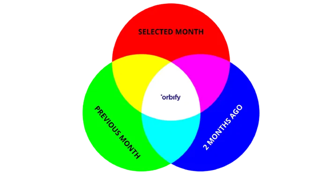
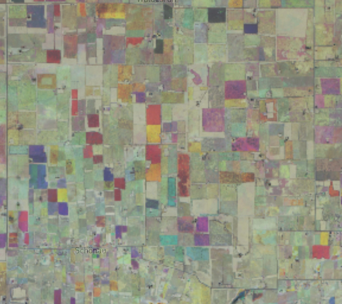
Areas marked RED have vegetation (high NDVI) in the selected month but no vegetation during the previous two months (low NDVI). Areas marked BLUE had vegetation two months before the selected date but didn’t have vegetation in the following months. Darker and bright/gray/white areas didn’t have any vegetation throughout the three months.
Thanks to the RGB representation, we can quickly identify areas that are growing or were likely harvested. We can easily interpret information about changes in our AOIs landscape.
Now, let’s convert this idea into an aesthetically pleasing web app on the Orbify platform. All hands on deck!
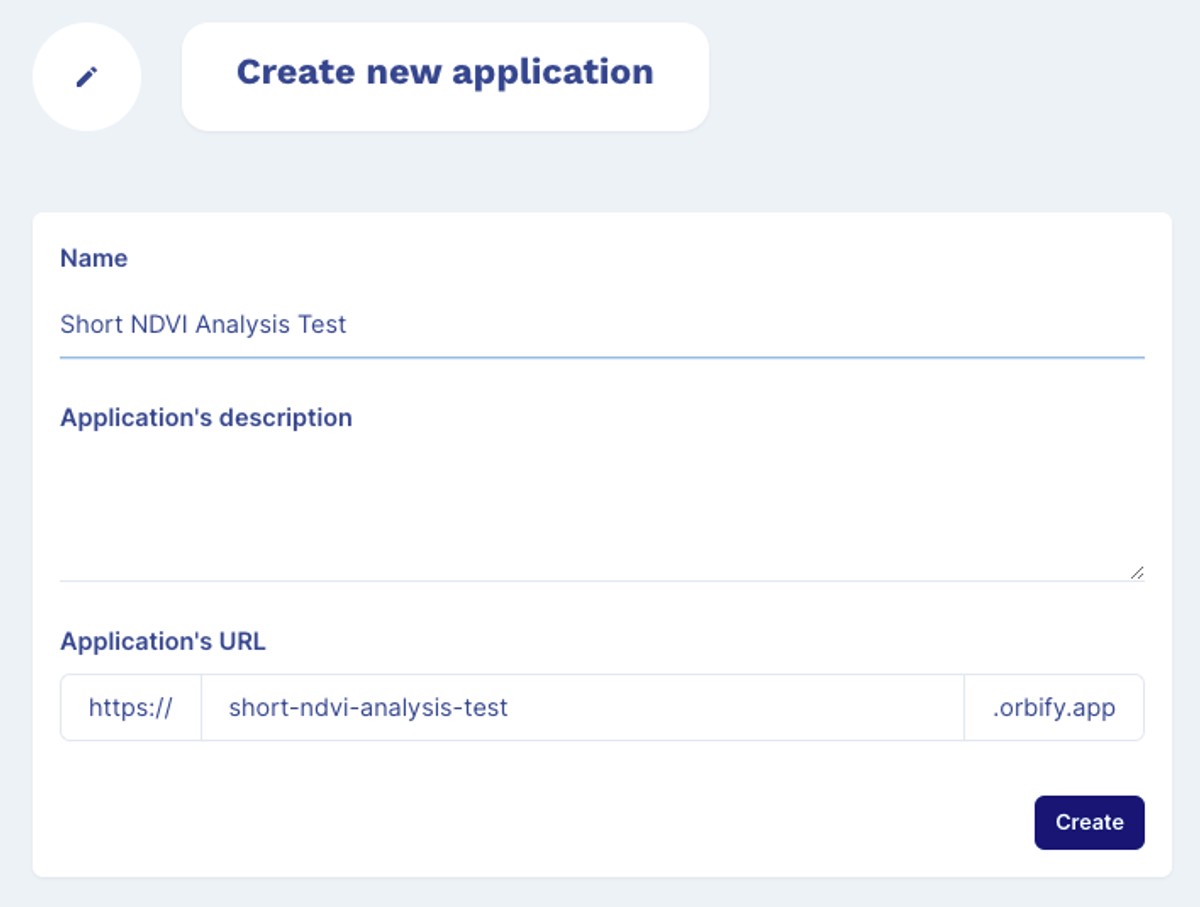
1.CREATE NEW APPLICATION
First, open the platform in your preferred browser and log in to your account at orbify.com. Then, click “ADD NEW APPLICATION” in the top right section of your dashboard.
2.NAME YOUR APP
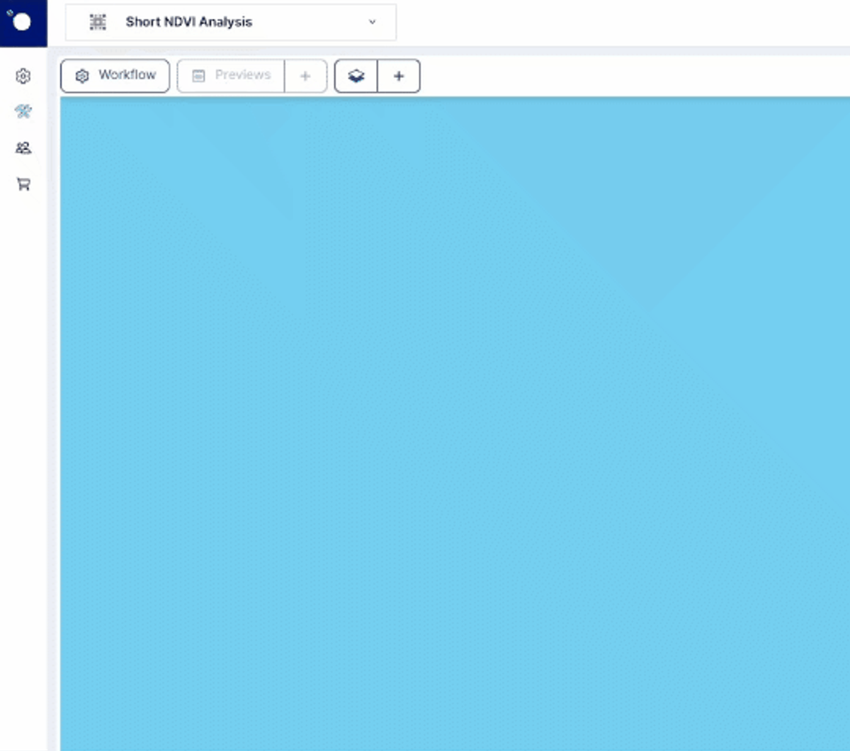
You’ll be taken to another tab where you can name and describe your new app. Let’s name it: “Short NDVI Analysis Test.” Click “Create” in the bottom right section. Save the app’s URL for later so you can share it.
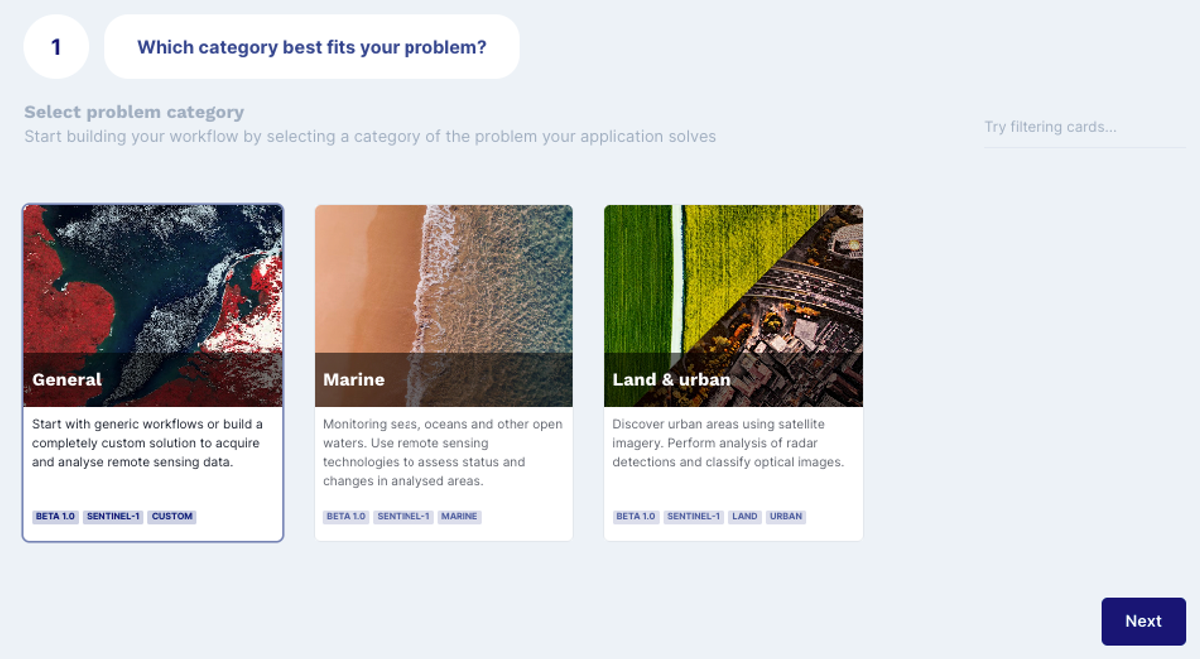
3.CHOOSE YOUR PROBLEM CATEGORY
To choose your application template, select the best category that fits your problem. We’ll choose GENERAL and click NEXT.
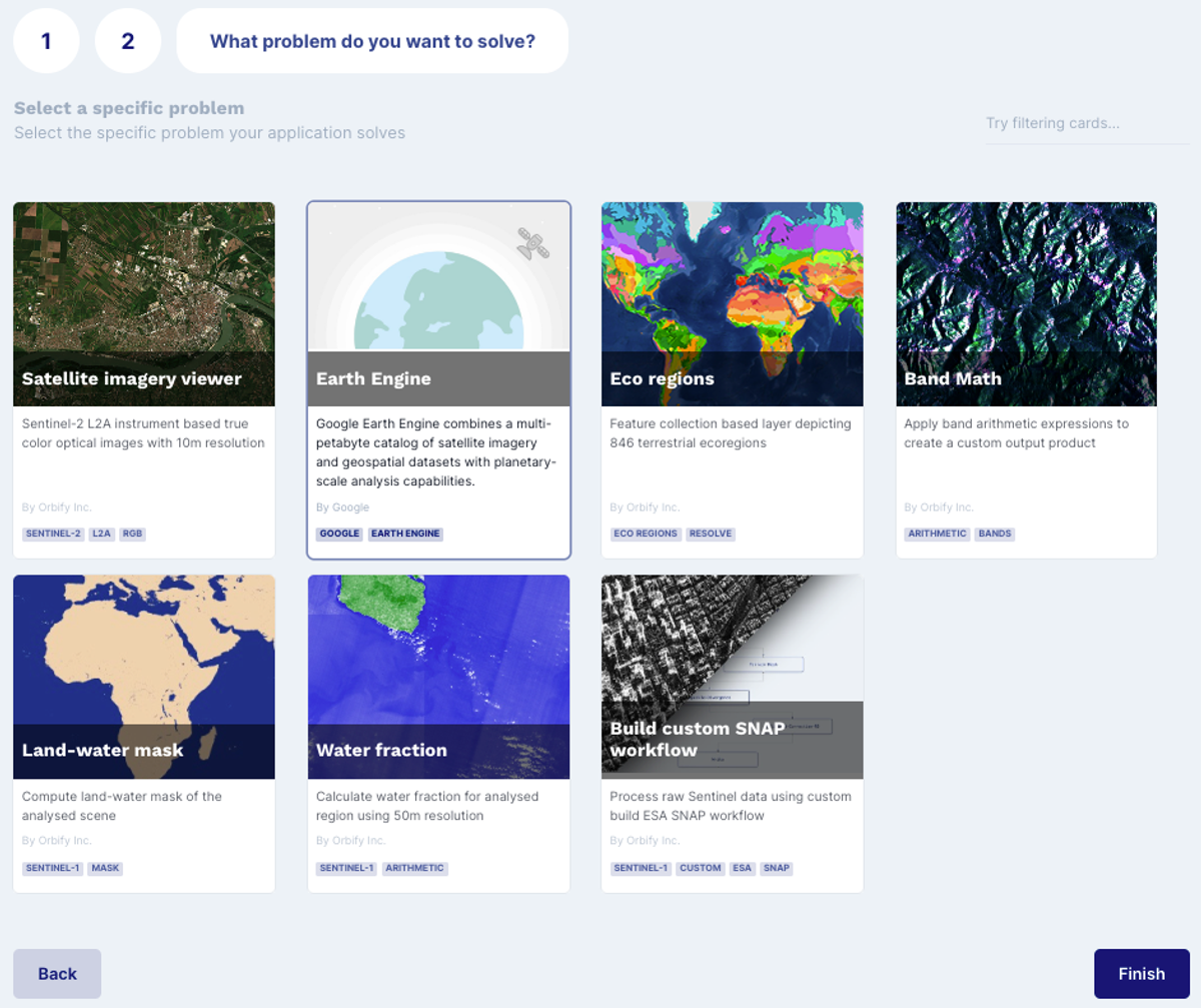
4.CHOOSE THE PROBLEM TYPE
This screen asks, “What problem do you want to solve?” In our case, we’ll select the Earth Engine.
A window pops up showing a basemap. You can now play around “app building.” Click WORKFLOW in the top left corner, and select EARTH ENGINE. A code editor window opens.
If you aren’t familiar with the Python API for GEE, don’t worry! Just copy-paste the code, try tweaking it, and see what happens. We’ll cover our Visual editor (No-Code) in later tutorials.
Now we can start the fun part.
First, we will import all packages needed for this app:
from datetime import date
from datetime import timedelta
from typing import List, Union
import ee
Next, we create the most useful functions for our study. We’re only using NDVI, but we’ll create a function with some more indices so you can also play around and test the same app with different indices.
def addIndicesS2(img):
ndvi = img.normalizedDifference(['B8','B4']).rename('NDVI')
ndmi = img.normalizedDifference(['B12','B3']).rename('NDMI')
sr = img.select('B5').divide(img.select('B4')).rename('SR')
ratio54 = img.select('B8').divide(img.select('B4')).rename('R54')
ratio35 = img.select('B3').divide(img.select('B8')).rename('R35')
return img.addBands(ndvi).addBands(ndmi).addBands(sr).addBands(ratio54).addBands(ratio35)
Now that we have our function to add indices, we create a function to mask clouds based on the QA60 band:
def maskS2clouds(image):
qa = image.select('QA60')
cloudBitMask = 1 << 10
cirrusBitMask = 1 << 11
mask =
qa.bitwiseAnd(cloudBitMask).eq(0).And(qa.bitwiseAnd(cirrusBitMask).eq(0))return image.updateMask(mask).divide(10000)
For the first part of our entry point function, we add variables related to the months. We have three date ranges respectively for the three months of analysis.
def entrypoint(
dates: List[date], region: ee.Geometry) -> List[Union[ee.Image, ee.Geometry, ee.FeatureCollection, ee.Feature]]:selected_date = dates[0]
start_date1 = (selected_date - timedelta(days=15)).isoformat()
end_date1 = (selected_date + timedelta(days=15)).isoformat()start_date2 = (selected_date - timedelta(days=45)).isoformat()
end_date2 = (selected_date - timedelta(days=15)).isoformat()start_date3 = (selected_date - timedelta(days=75)).isoformat()
end_date3 = (selected_date - timedelta(days=45)).isoformat()prediction_date_start = (start_date1,end_date1)
prediction_date_1bef = (start_date2,end_date2)
prediction_date_2bef = (start_date3,end_date3)
Now, we create three images for each month, applying our function to calculate the indices and mask clouds. To have better data related to near-zero cloud cover, we’ll filter the images based on a ‘’CLOUDY_PIXEL_PERCENTAGE” of less than 5%.
cloud_cover_value = 5
image1 = ee.ImageCollection('COPERNICUS/S2').filterDate(prediction_date_start[0],prediction_date_start[1]).filter(ee.Filter.lt('CLOUDY_PIXEL_PERCENTAGE', cloud_cover_value)).map(maskS2clouds).map(addIndicesS2).mean();
image2 = ee.ImageCollection('COPERNICUS/S2').filterDate(prediction_date_1bef[0],prediction_date_1bef[1]).filter(ee.Filter.lt('CLOUDY_PIXEL_PERCENTAGE', cloud_cover_value)).map(maskS2clouds).map(addIndicesS2).mean();
image3 = ee.ImageCollection('COPERNICUS/S2').filterDate(prediction_date_2bef[0],prediction_date_2bef[1]).filter(ee.Filter.lt('CLOUDY_PIXEL_PERCENTAGE', cloud_cover_value)).map(maskS2clouds).map(addIndicesS2).mean();
Next, we add each image as a band by selecting the index of interest — the NDVI.
image_rgb = image1.select('NDVI').addBands(image2.select('NDVI').rename('NDVI_minus1')).addBands(image3.select('NDVI').rename('NDVI_minus2'))
Finally, we finish our entry point function with the variable we need to return : image_rgb created with the three NDVI bands, one for each month. We set the visualization parameters (from 0 to 1) for better color contrasts in our image.
return [image_rgb.visualize(min=0, max=1)]
And that’s it!
Now, you just need to click SAVE CHANGES on the top left corner. On the coding side, everything is done.
Let’s jump to the testing.
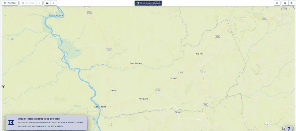
To test our app, use the preview functionality by clicking the green DRAW AREA OF INTEREST button. Draw an area of interest wherever you want in the world.
Create your AOI (polygon) by drawing it on the map. Then press ENTER to finish the polygon and then click on the SAVE green button on the upper tab.
Create your AOI (polygon) by drawing it on the map. Then press ENTER to finish the polygon and then click on the SAVE green button on the upper tab.
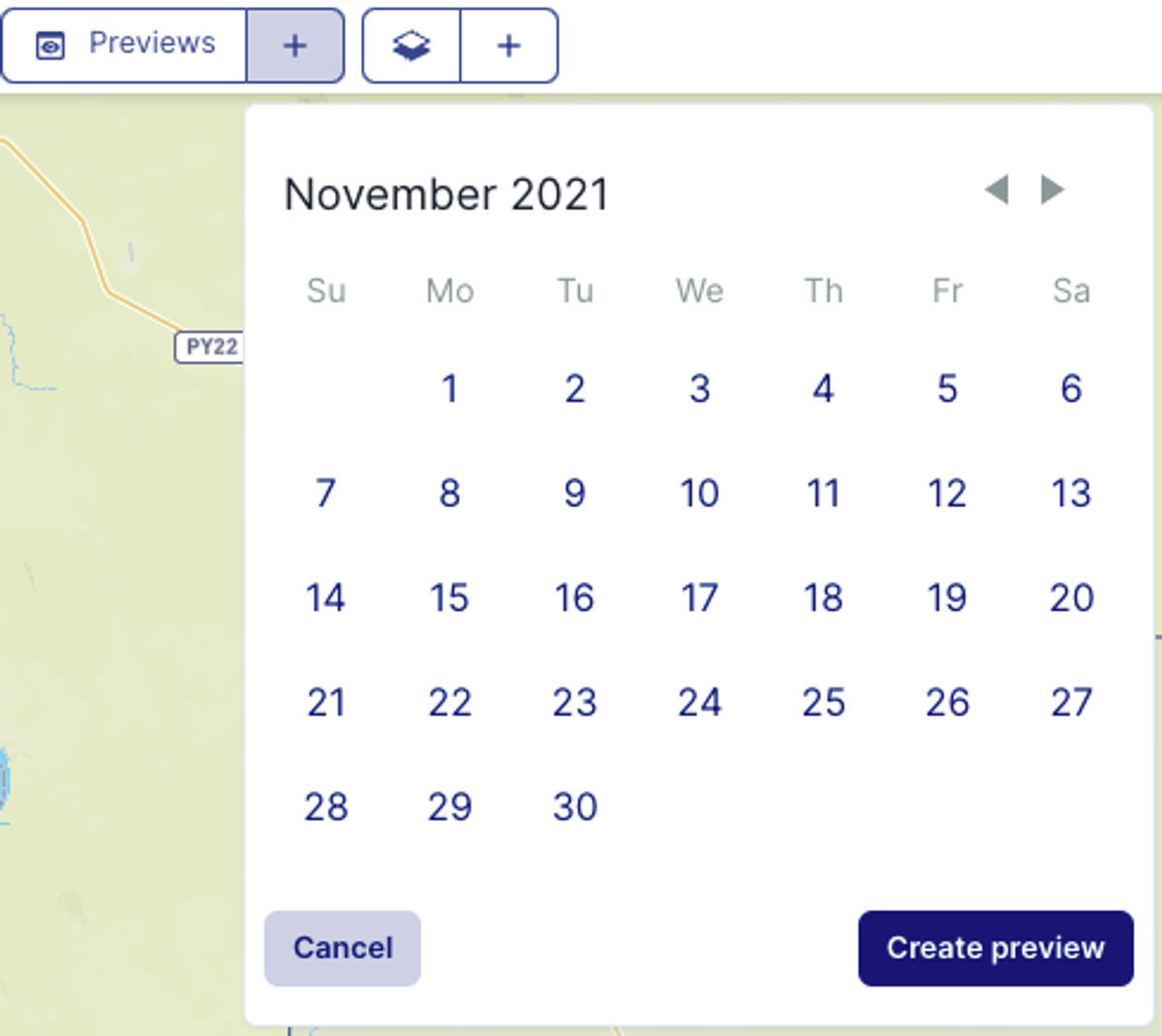
Click the + sign on the upper left tab near the PREVIEWS button to add a new preview order.
Select the date you’re interested in, and click Create Preview.
Give it some time to process the data.
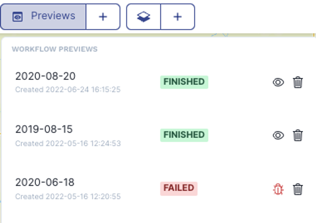
Once the process is complete, a green box appears next to your order date. You’ll see a red “FAILED” box if something went wrong. Click the bug to investigate.
To display results, click the EYE near the TRASH icon. You’ll be able to see your RGB image and conduct your visual analysis.
Now you know how our previews work.
Type the app’s URL in your browser to see how it looks for your end users.
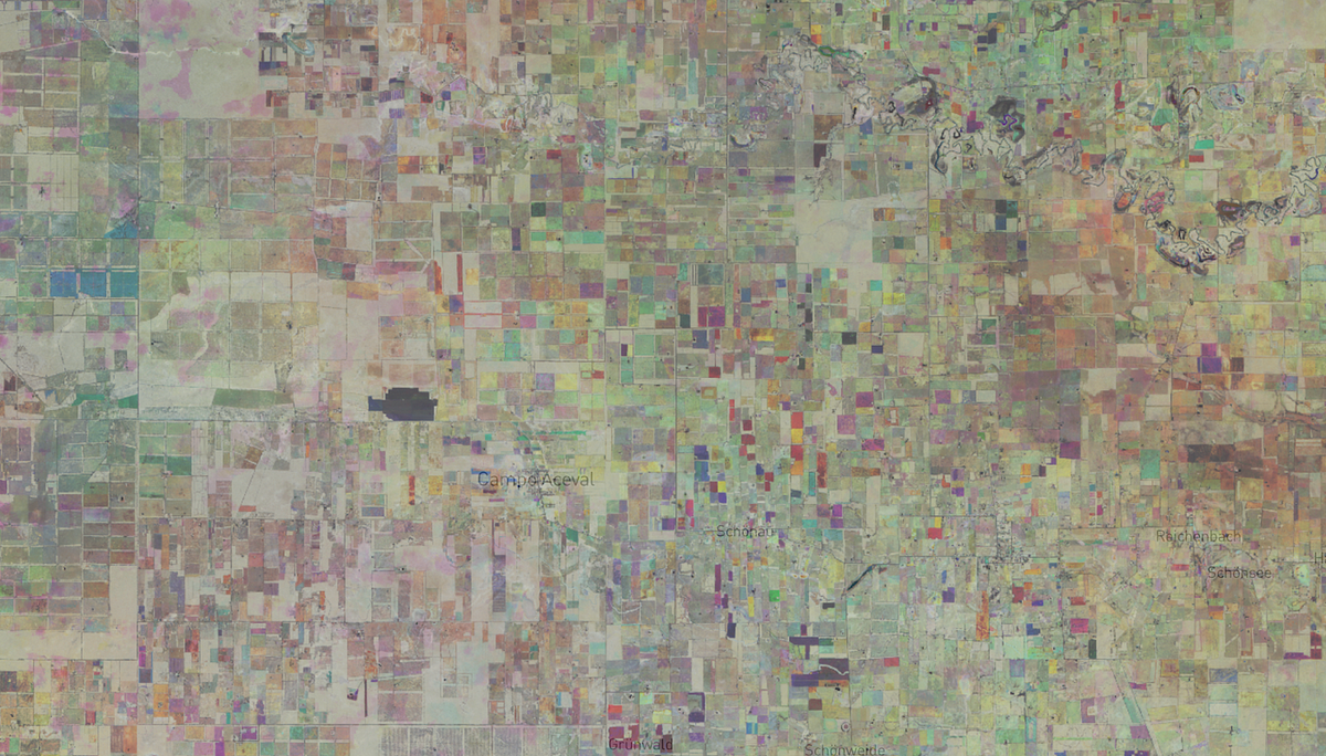
Let’s zoom-in on a specific area in order to carry out our inferences:
NDVI indices are effective tools that help in monitoring and classifying agricultural fields. You can apply different indices depending on your needs — whether it’s for identifying burned areas or looking at moisture levels . An appropriate mix of data from spectral reflectances can capture all kinds of information.
If you want to build your NDVI app, look no further than Orbify.
Orbify is the easiest way to deploy interactive geo-intelligence applications. Head to the platform right now and check it out for yourself.
6 mins read
November 20, 2023
10 mins read
October 4, 2022
8 mins read
August 17, 2022